


"The first Velvet Underground album only sold 10,000 copies, but everyone who bought it formed a band." - Brian Eno
I’m pretty sure the above quote is mostly hyperbole, but I wonder if Alex Toth isn’t the Velvet Underground of comics.
Alex Toth is a comic art legend, but many casual comic book readers are probably unaware of his wide reach and influence. I think part of this is due to his philosophy of comic book art being a bit of a antithesis to what modern comic book fans are looking for.
For the most part comic book art has become more detailed, and more realistic, eschewing the “cartoon” art of it’s infancy. I grew up on the comic book art of the late 80’s and early 90’s. Arthur Adams was my art god, and his early work was a lot of lines and a lot of texture. Todd McFarlane was just a messier Art Adams imitator, and Liefeld just a poor substitute. To be fair to Arthur Adams, who is still a comic art god, his style evolved as he improved and all the excess lines started to go away. At first, I didn’t like it, because I thought I was getting less than I was getting before, but, I honestly, love his new economical style now that it has fully evolved. Unfortunately, McFarlane and Liefeld never fully evolved and just continued to add a bunch of lines for no actual purpose. Not that McFarlane even draws comics anymore, but some of his recent drawings do seem to have less of that death by a thousand scratchy lines look to them.


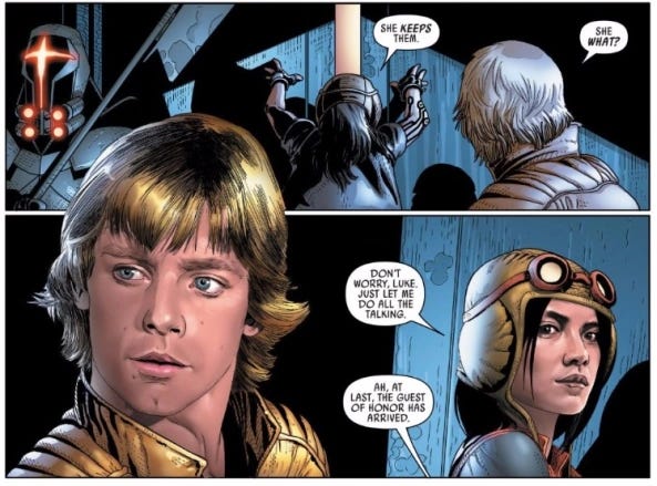
In more recent history, a lot of comics have started to push a photo-realistc style where everything looks almost too realistic, for my taste. To be fair, I am a sucker for a little Mike Deodata, Steve Epting, and Mike Perkins, who definitely lean heavily into this style. But, in general, I prefer comic art that is a little more cartoony and stylized. For me, overly photo-realistic art has a tendency to pull all the life and dynamism from a drawing. It ends up looking like stills from a film (see below).
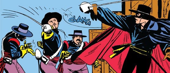
Which brings us back to Alex Toth, who seemed to evolve into a less is more style as he went through his career. His philosophy seemed to be to strip every superfluous line from every drawing until all you had left was the essentials. However, the bigger question: is that what fans want? My initial thought, is that most fans want more detail and more realistic art because they think they are getting “more” while not appreciating that it is much harder for an artist to strip a drawing down than to add a bunch of unnecessary details.
Case in point: Any recent Frank Miller drawings are almost universally disliked compared to his output in the 80’s and 90’s. Now, I don’t want to get into the merits of those actual drawings since that is a whole different conversation and I don’t have the expertise to effectively critique those drawings. But Frank Miller’s recent covers are definitely a stripped down/less is more approach to comic art.


However, there are some artists who have been successful with a less is more comic art style. Bruce Timm has a very animation-like style that is very stripped down. The late, great Darwyn Cooke is another good example. Chris Samnee uses thick evocative Alex Toth-like lines to convey shadow and depth while maintaining a economy of line style. Also, I can’t forget to mention one of my favorite artists of the last few years, Greg Smallwood, who has some how managed to combine an Alex Toth economy of line with a somewhat realistic style. To be honest, Greg’s stuff is a little bit of magic to me, and I’m not sure I want to know how he does it.
So, Alex Toth’s influence seems to be alive and well in modern comic book art, and, although, comic art still seems to be in it’s long death march toward hyper detailed art. A less is more approach can still be successful with the right craft and sensibility.
I think you and I agree on the “standard” for comic art. It’s great to visualize the lineage you highlight (and I would add Bradshaw as the latest on that stylistic family tree.) I love art from folks like Olivetti or Sienkiewicz, but Toth seems to represent a classic style that feels like what a monthly book should look like. The art is one of the qualities that makes Watchmen so perfect (for example.)